
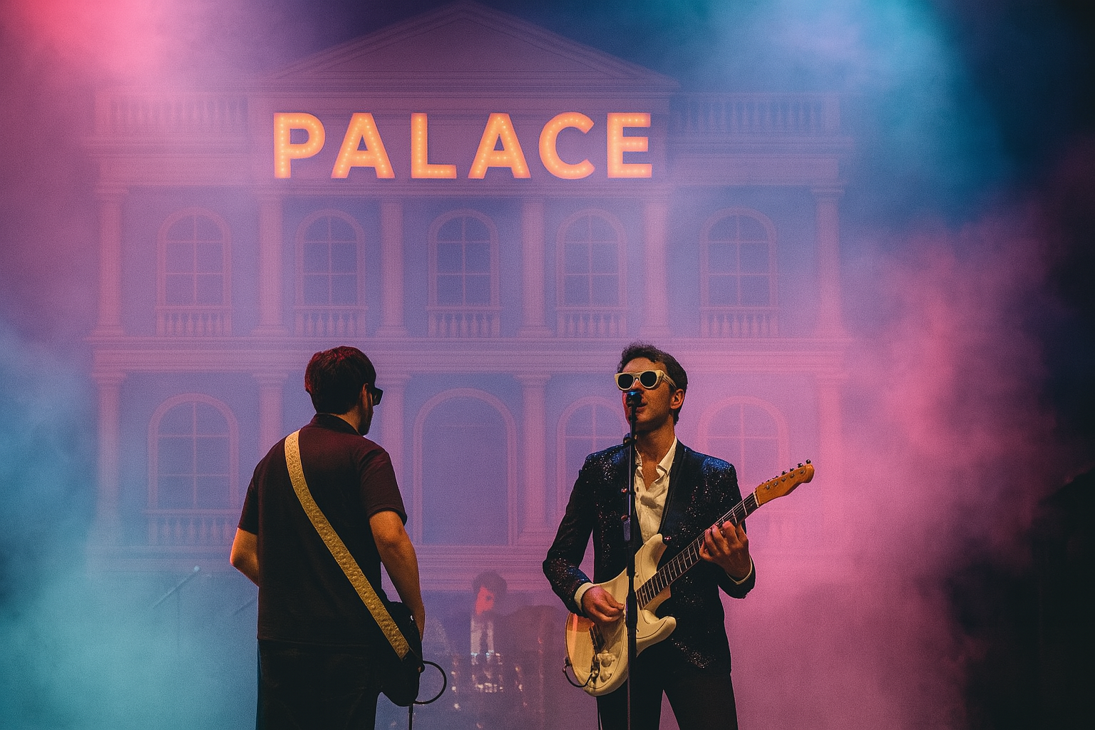
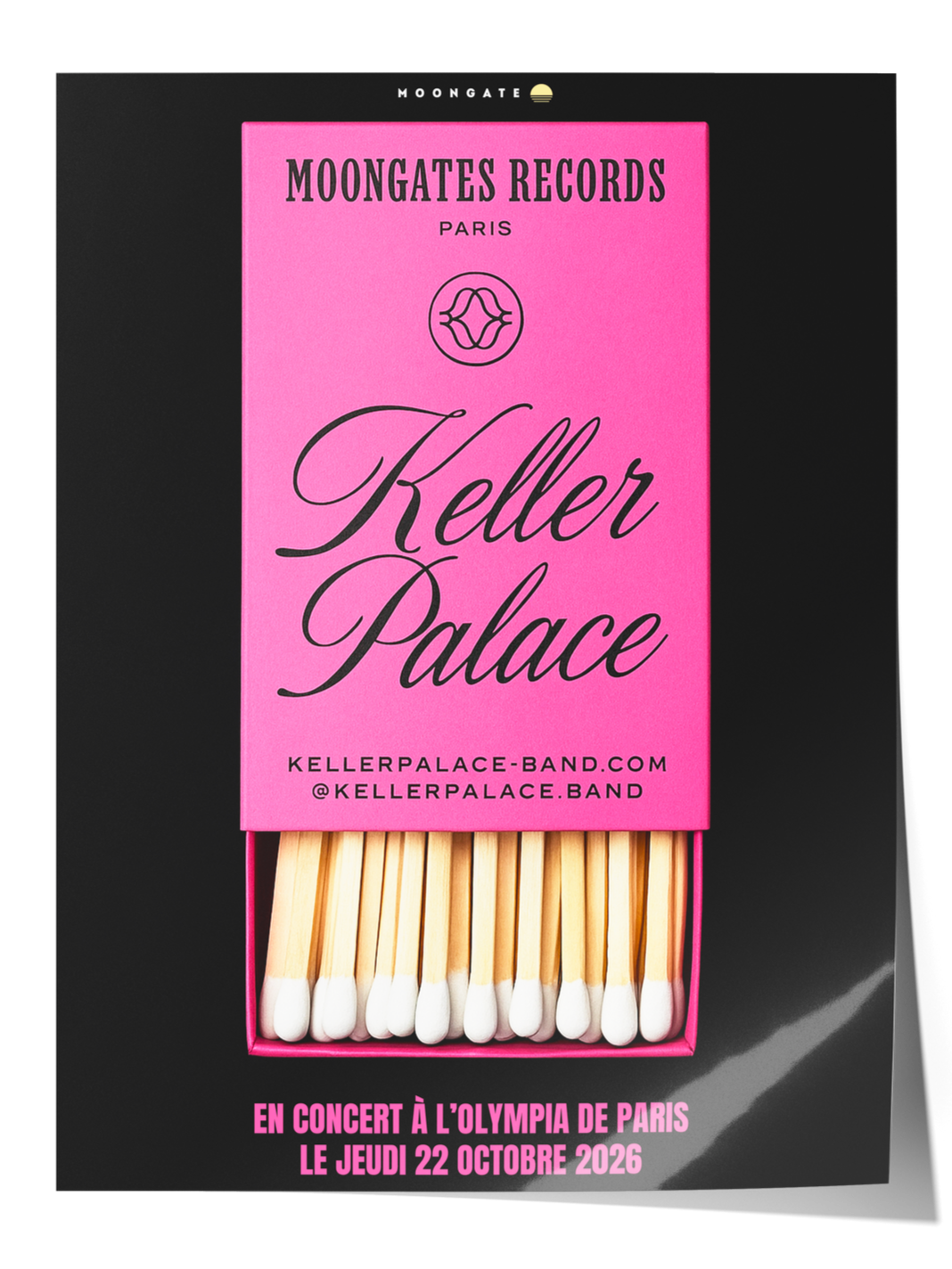
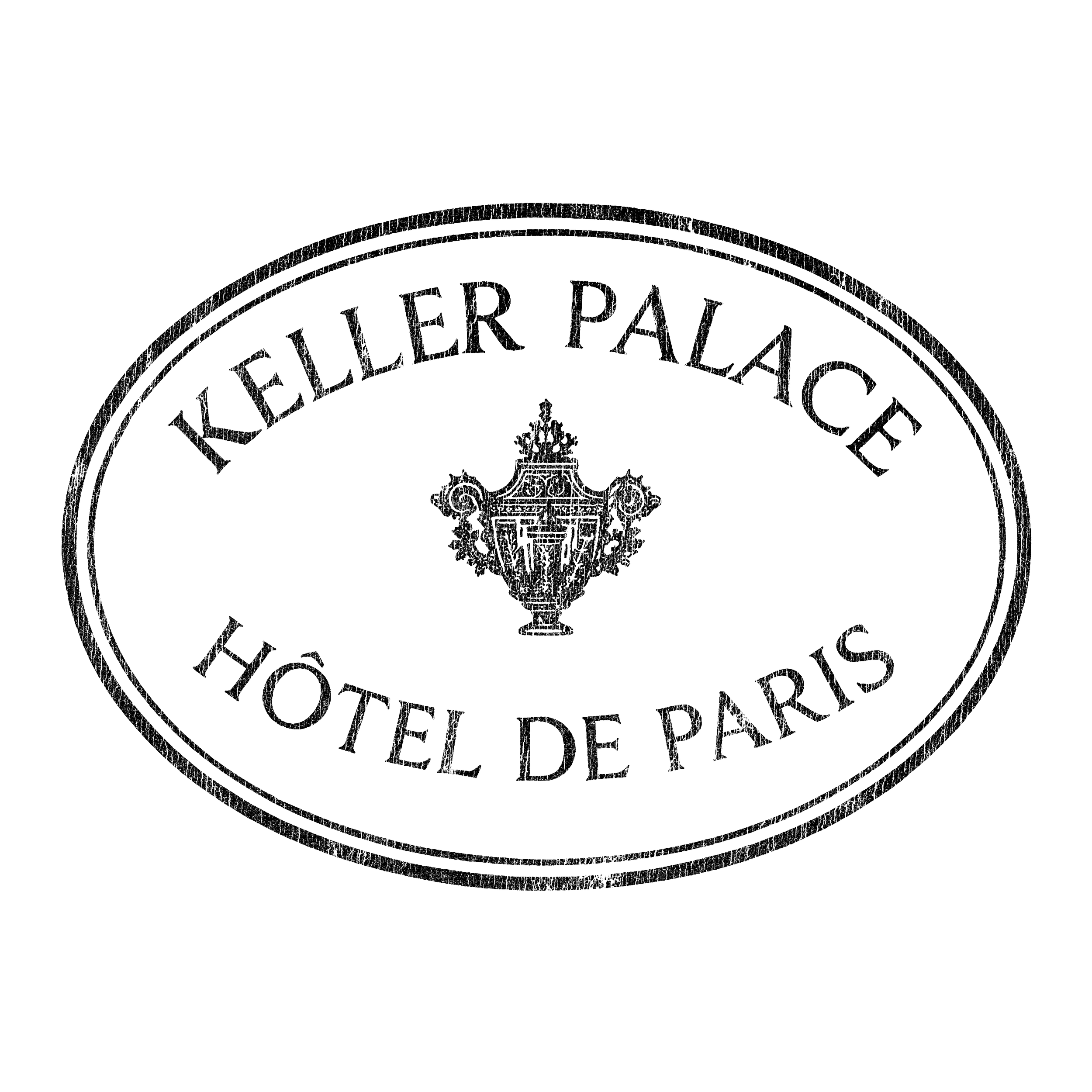
KELLER PALACE — Rock ‘N’ Roll Brand Design & Art Direction
BRAND DESIGN, ART DIRECTION, NAMING, VISUAL IDENTITY
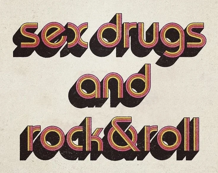
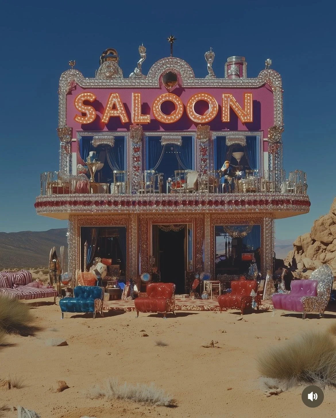
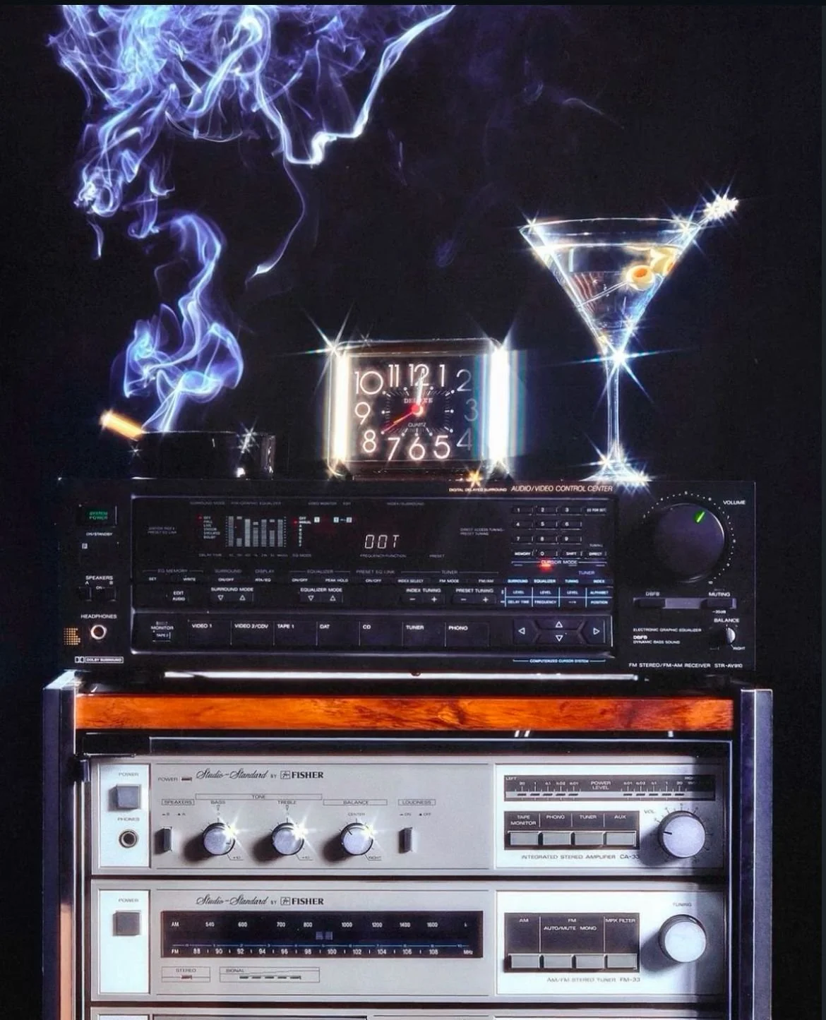
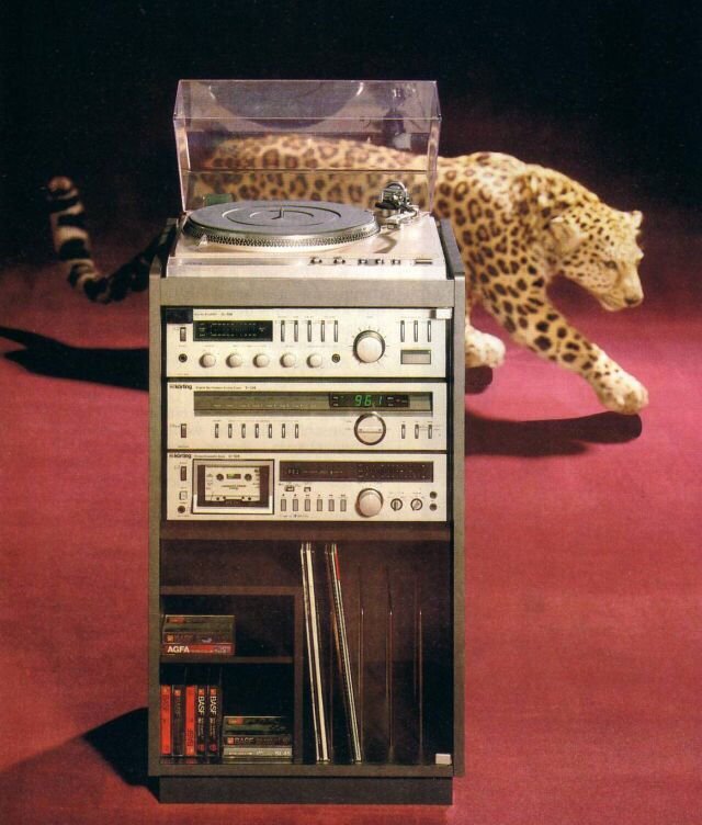
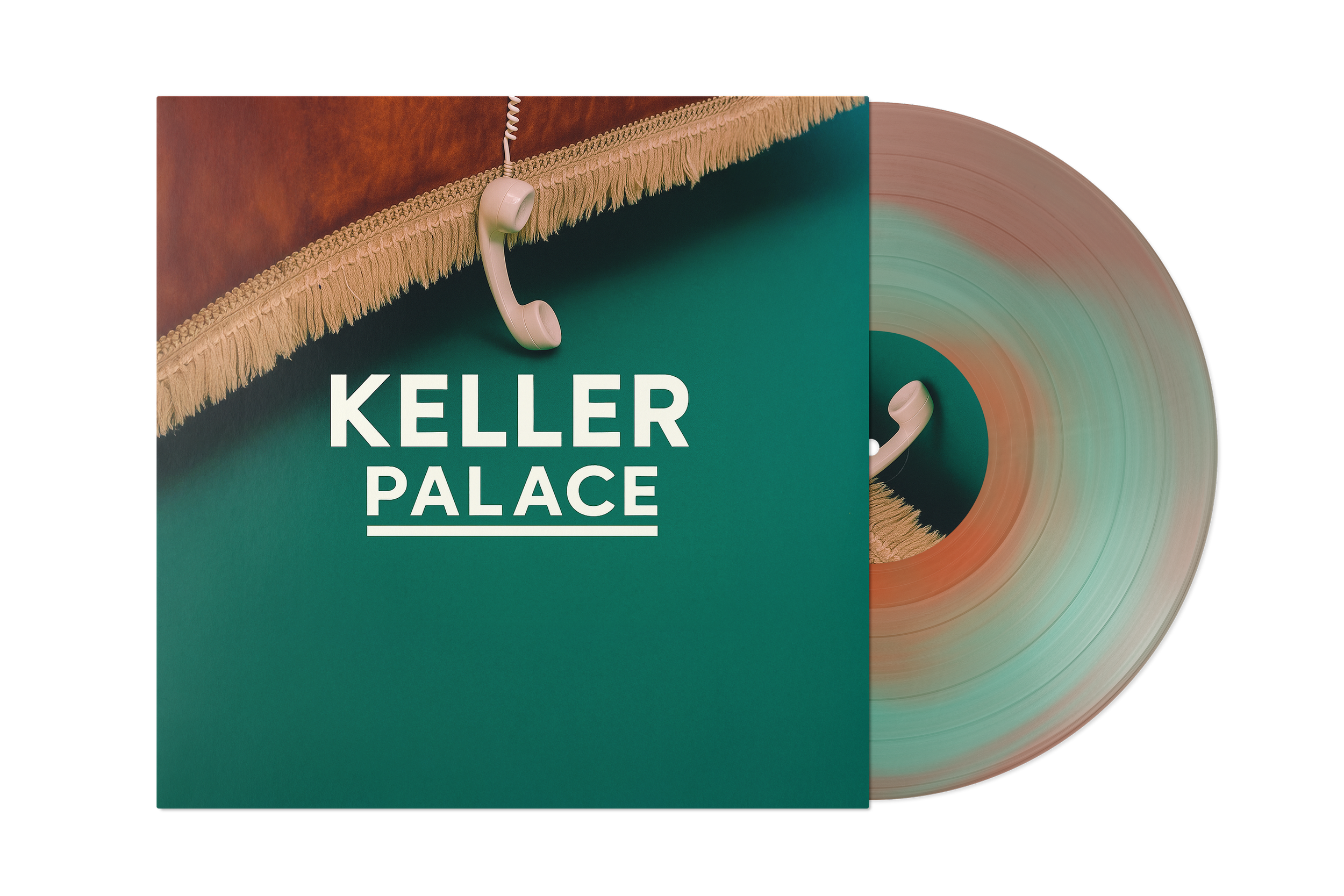
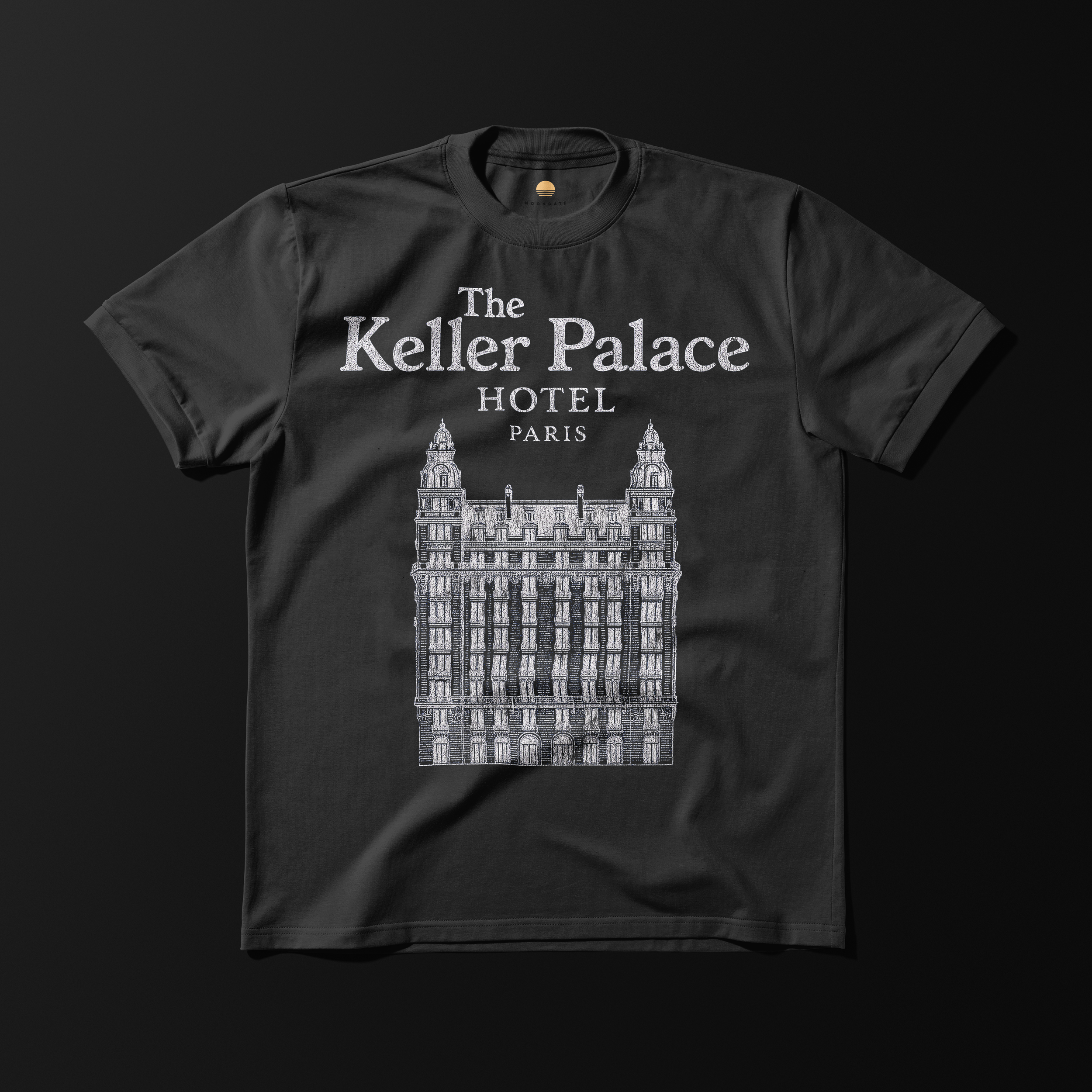
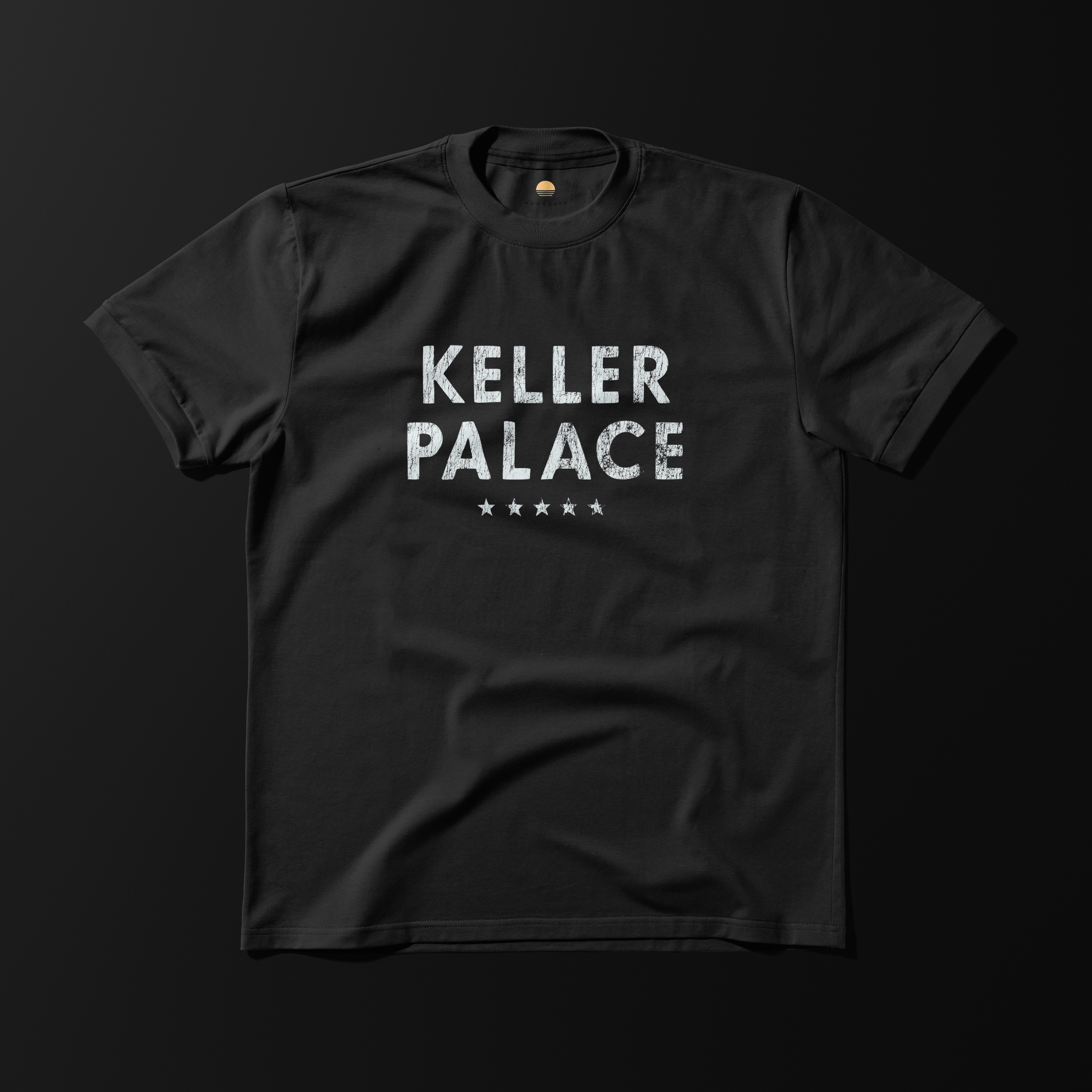
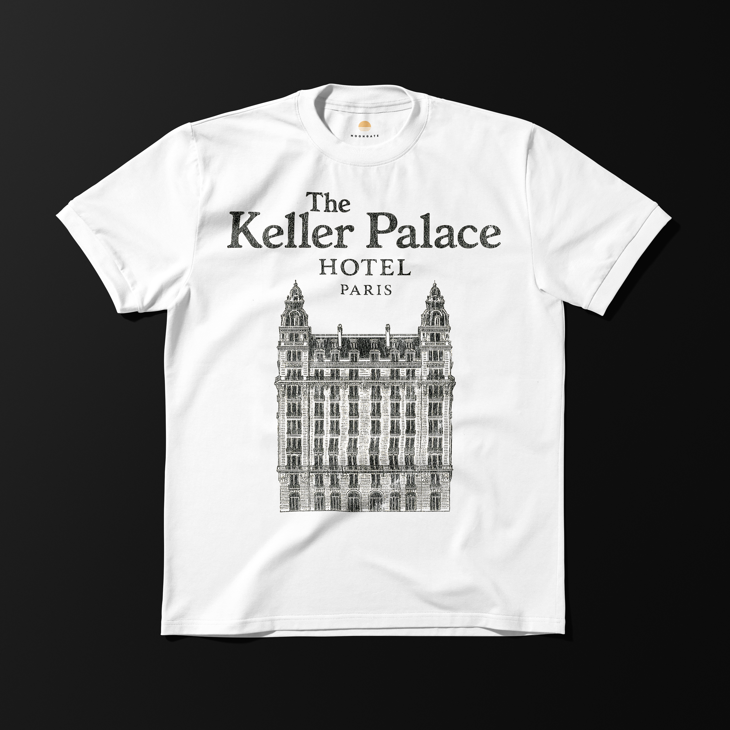
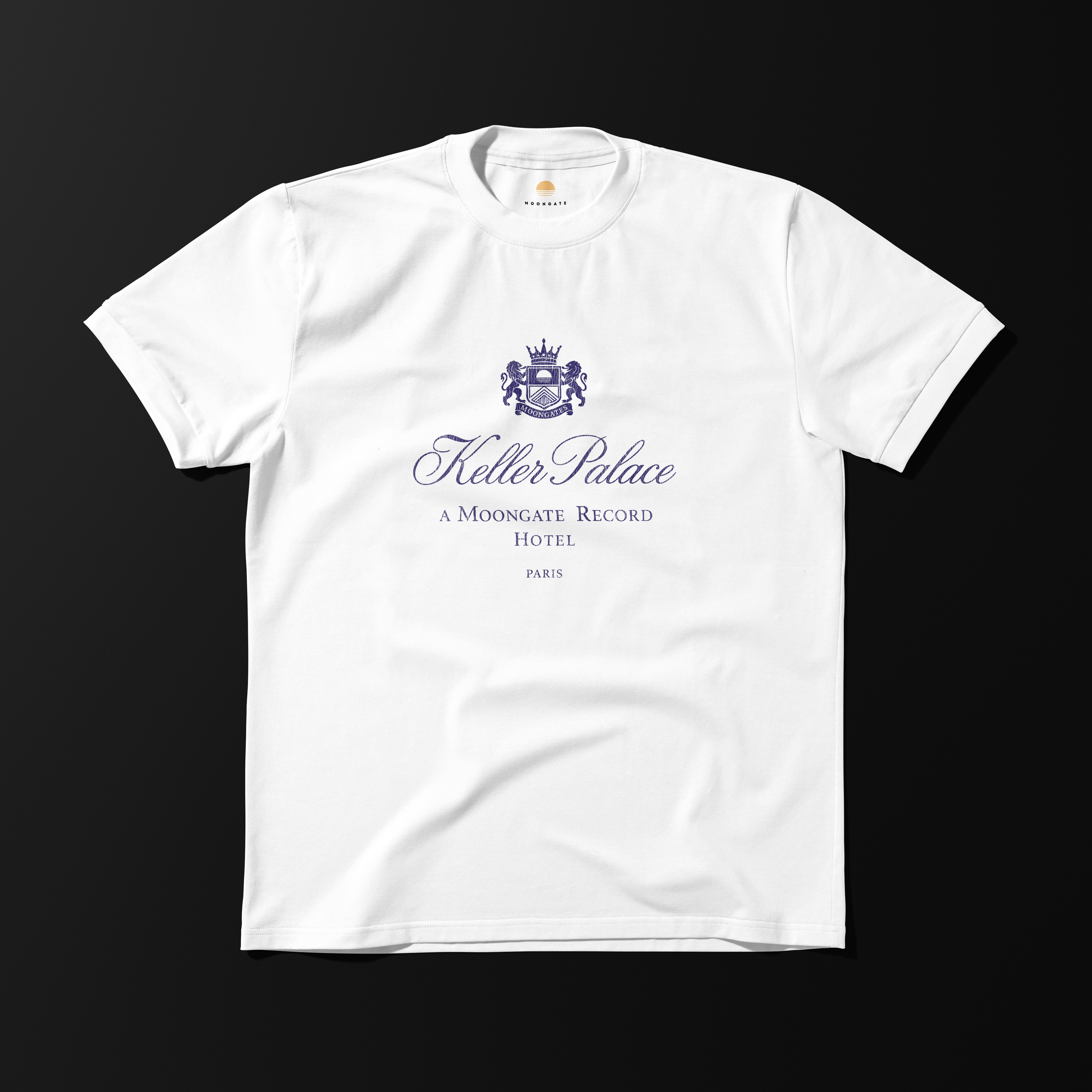
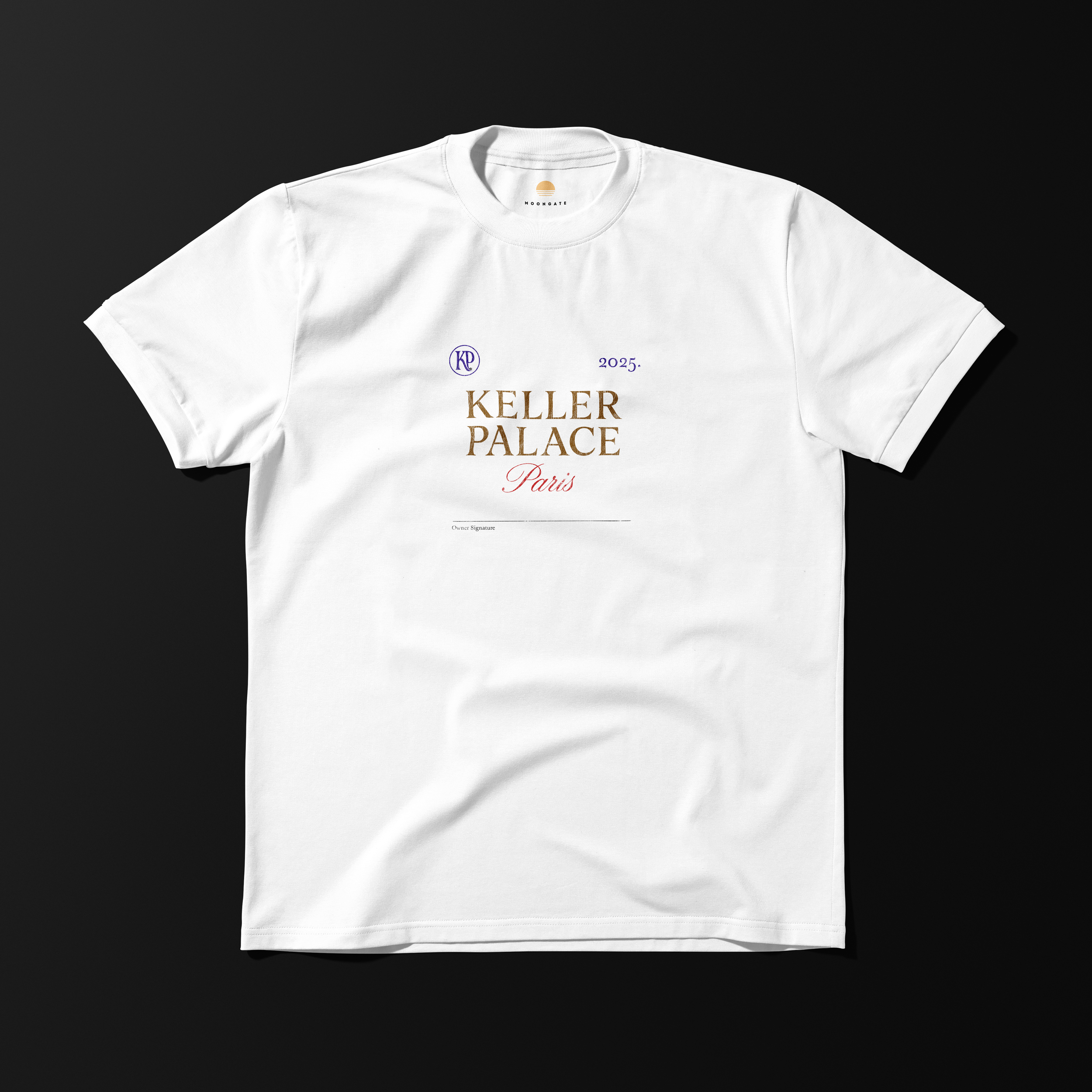
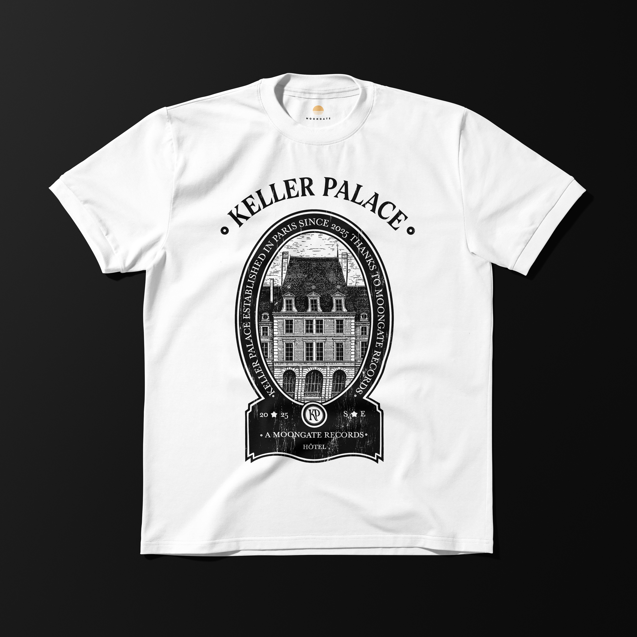
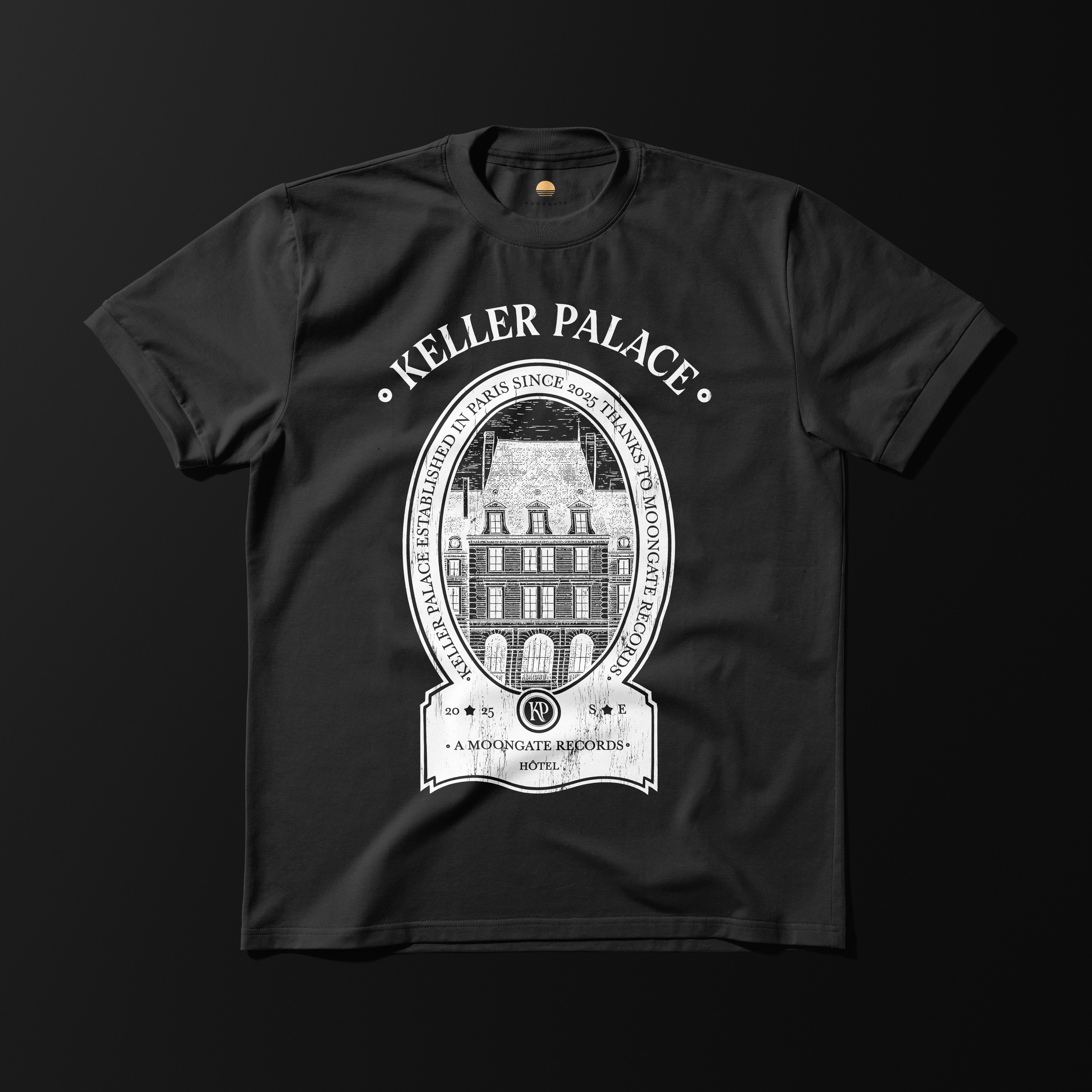
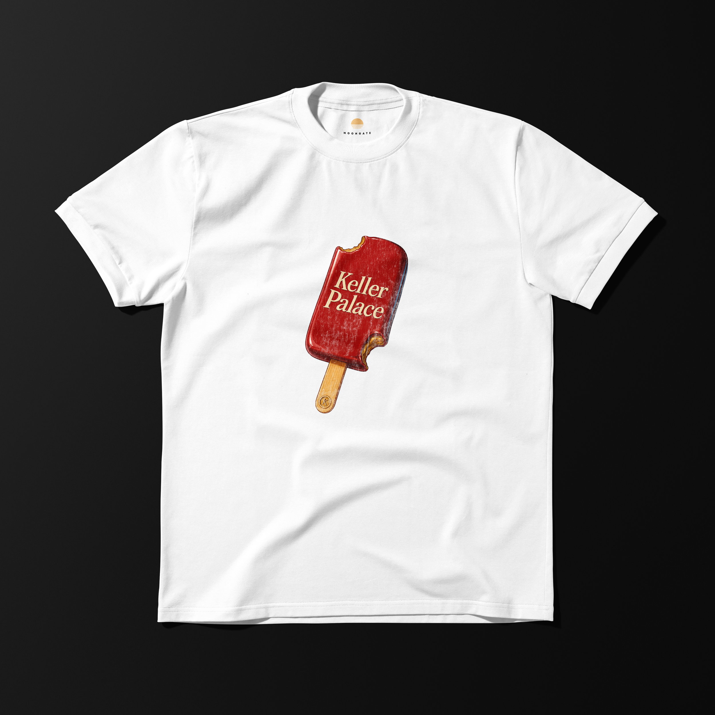
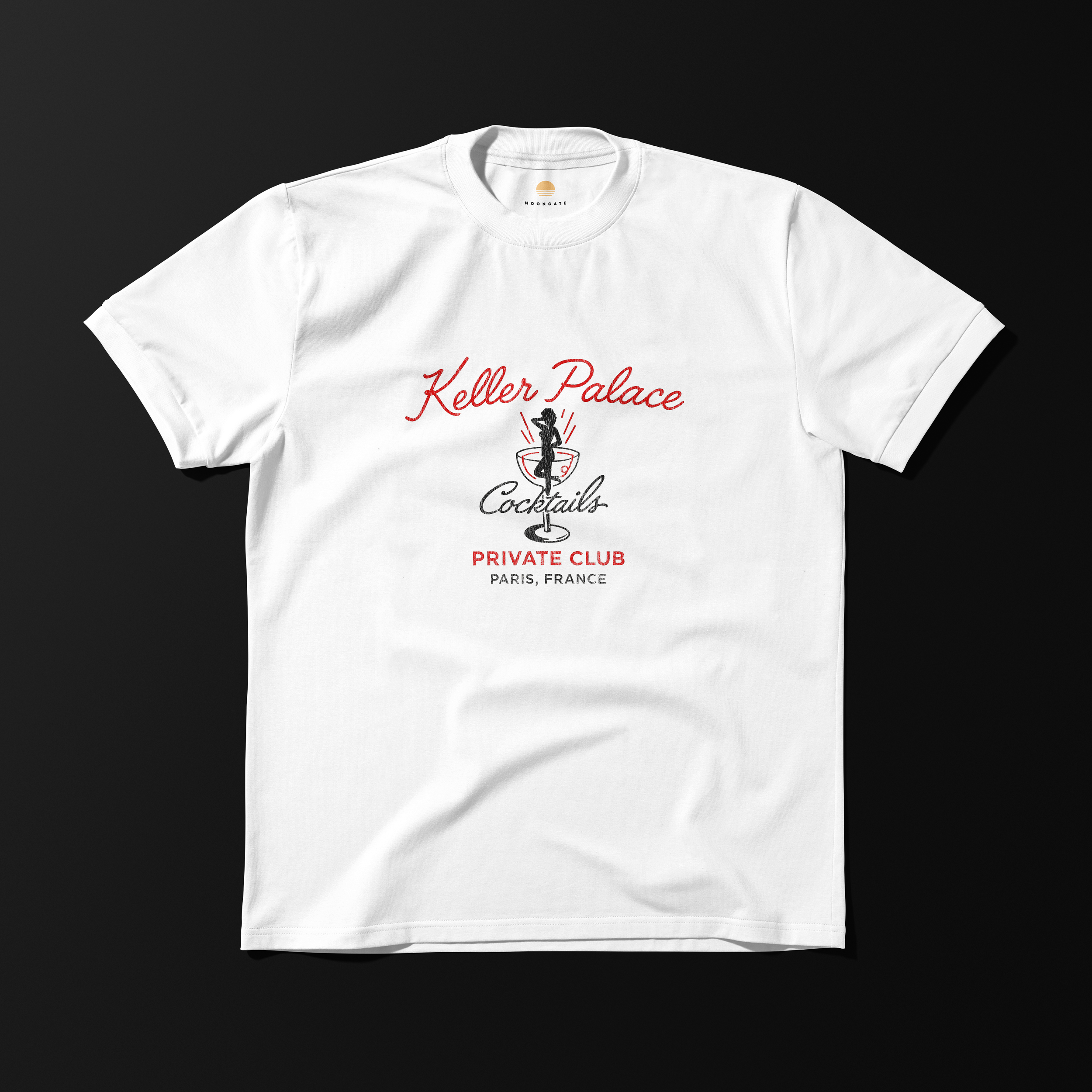
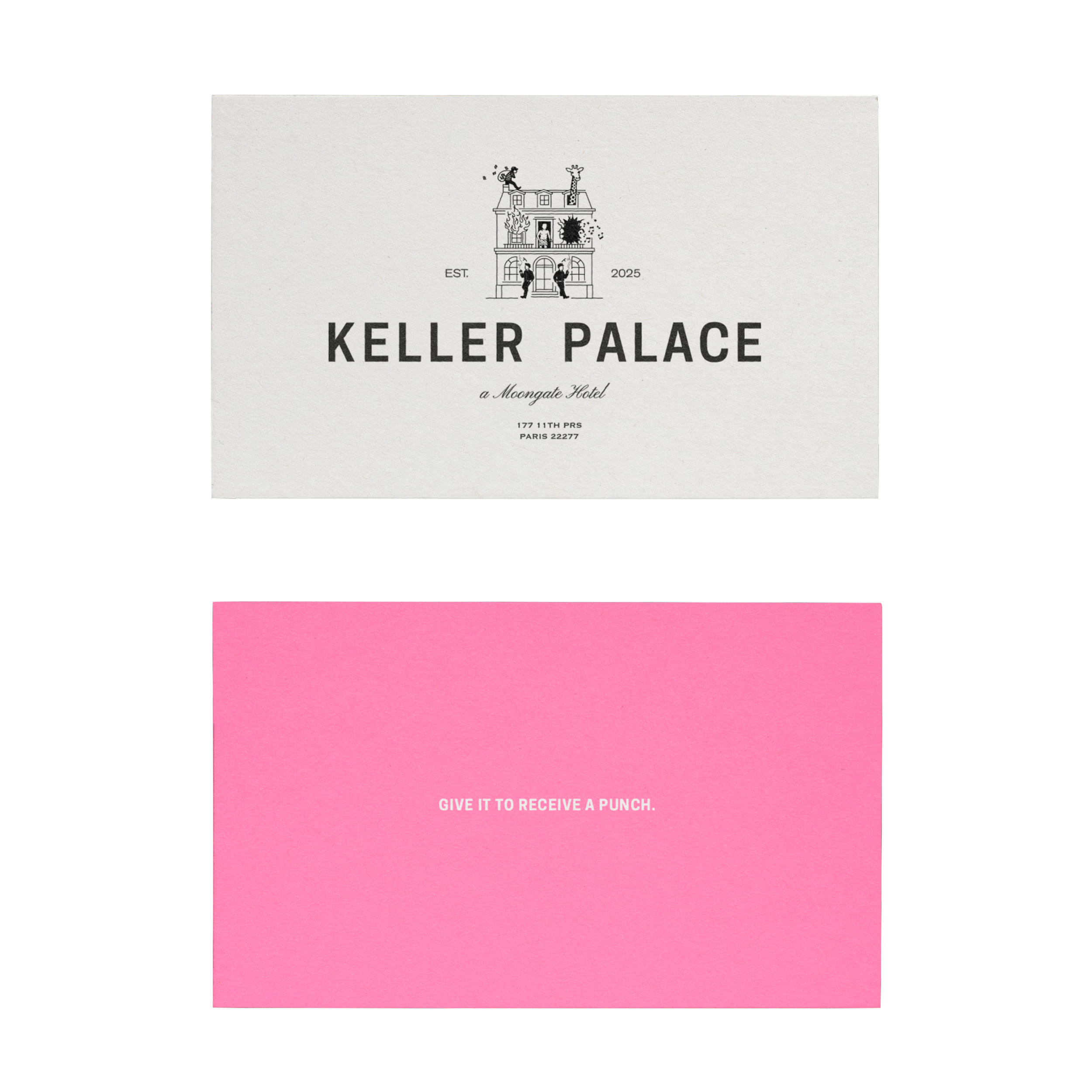
Keller Palace was conceived as a brand with a strong and immediate presence, rooted in a more instinctive and expressive visual culture.
From naming to visual identity, the project aimed to capture a form of raw energy while maintaining a controlled and readable structure.
The challenge was to avoid chaos — translating this intensity into a system that remains coherent and recognizable.
Typography, illustration, and composition were developed to coexist within this balance, creating an identity that feels both spontaneous and constructed.
A brand defined by contrast — between tension and control, gesture and structure.

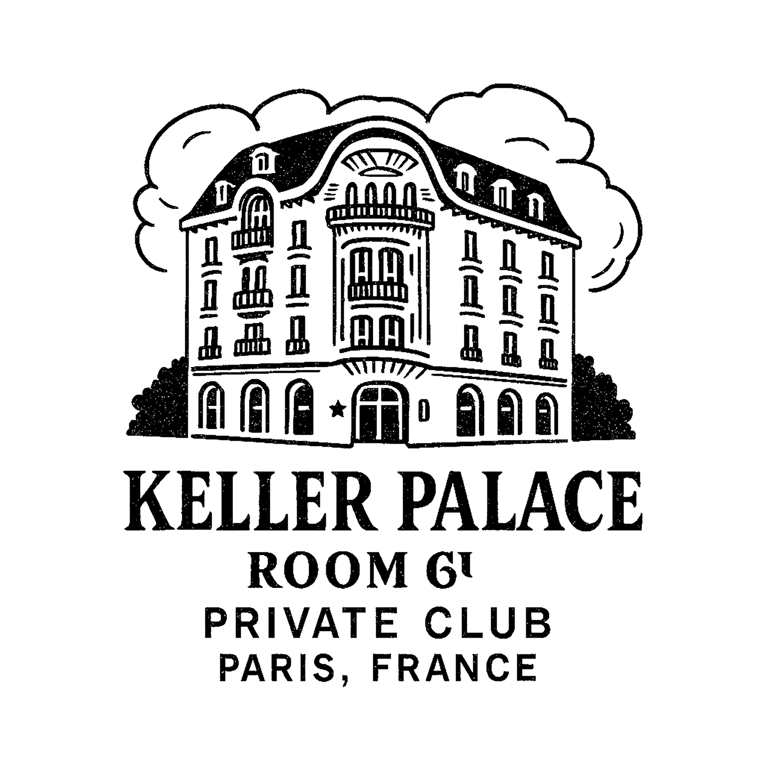
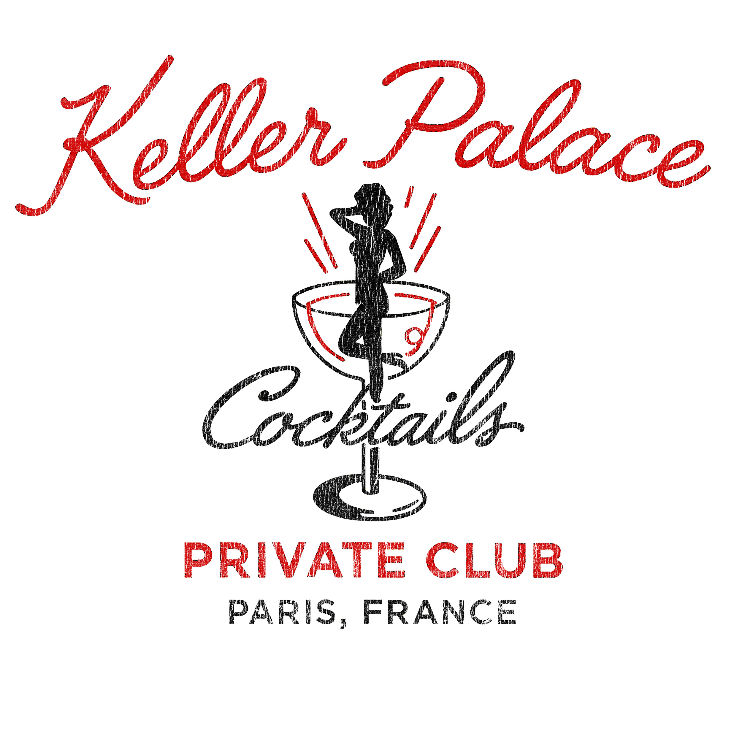
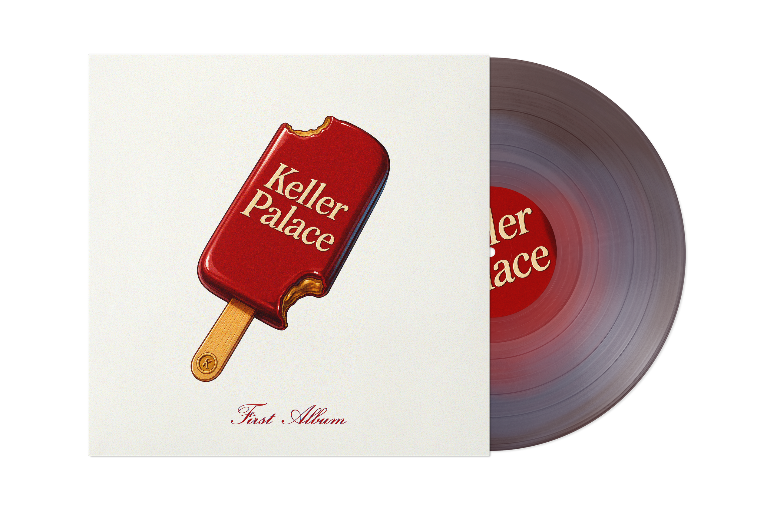
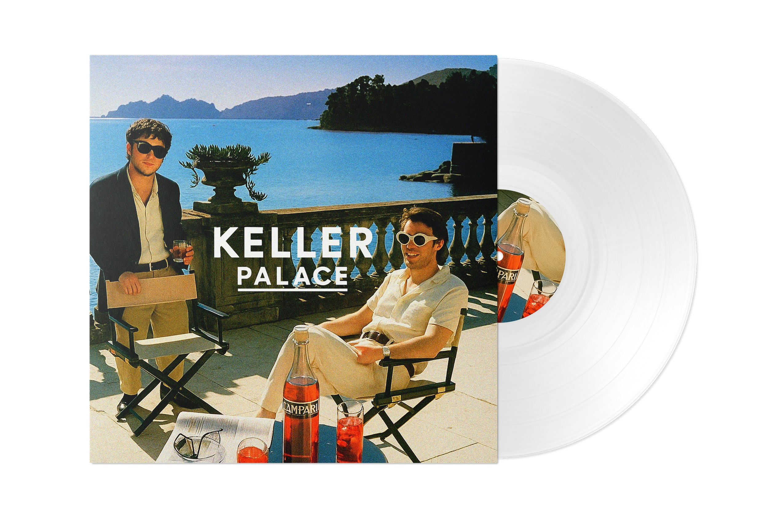
KELLER PALACE — Brand Design & Art Direction
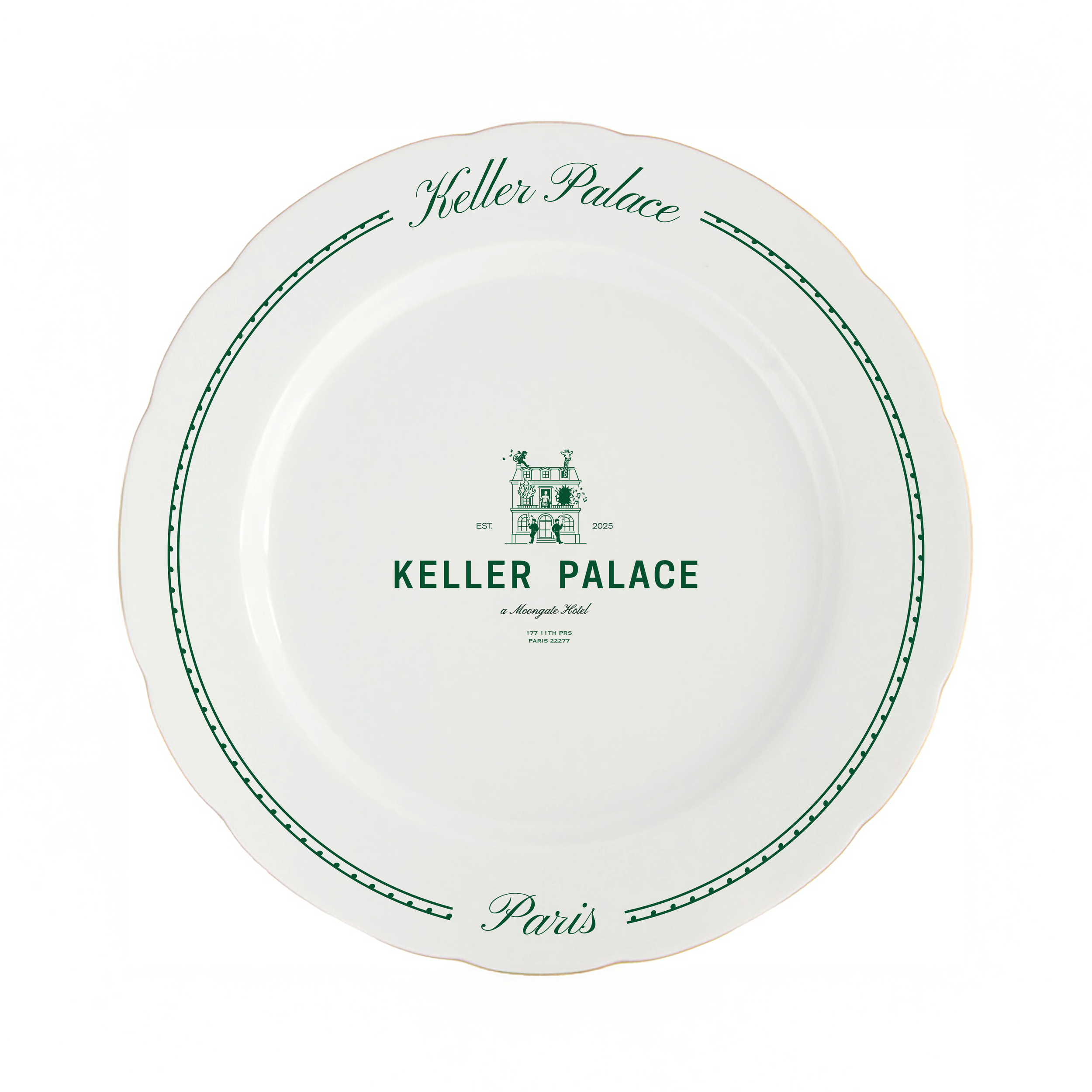
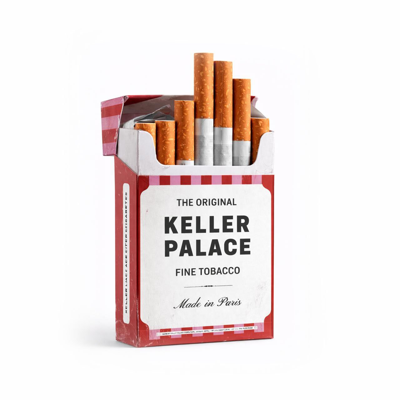
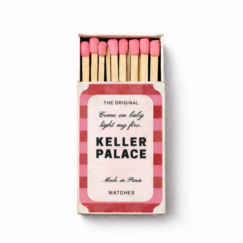
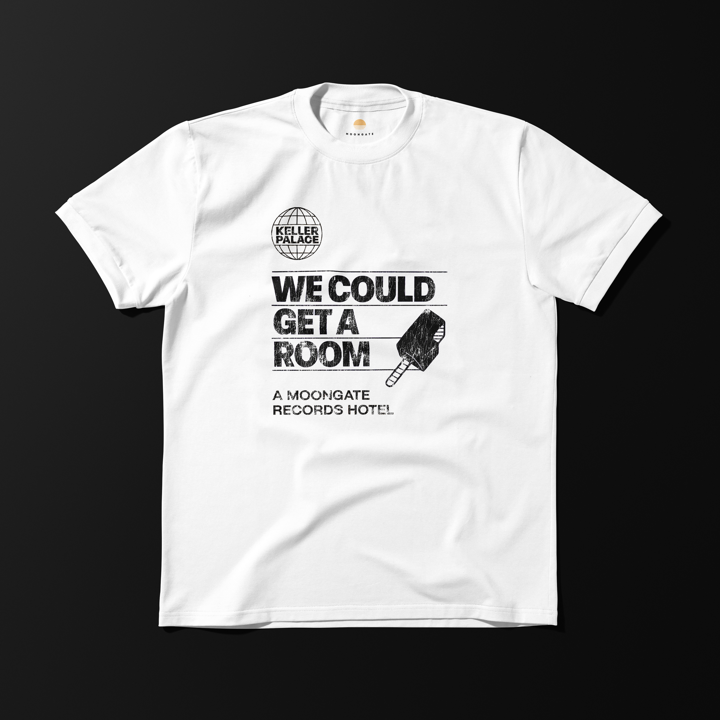
A complete brand creation, built around a tension between raw energy and controlled expression.
The project defines a singular identity, where visual elements remain direct, almost instinctive, yet structured through composition and proportion.
An approach balancing spontaneity and discipline, allowing the brand to exist with both attitude and coherence.


UP NEXT
SCHOTT USA